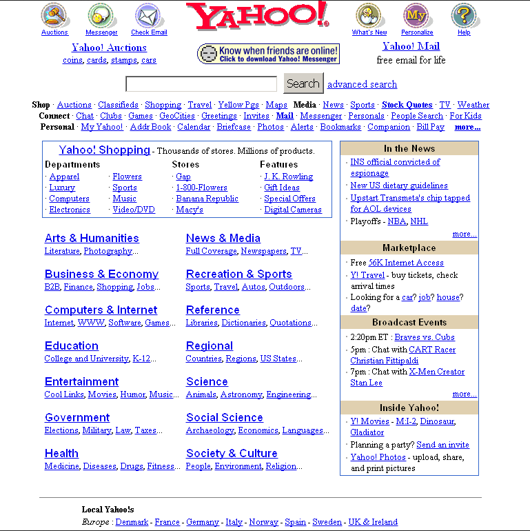
Here is a screenshot of Yahoo’s homepage from the year 2000.
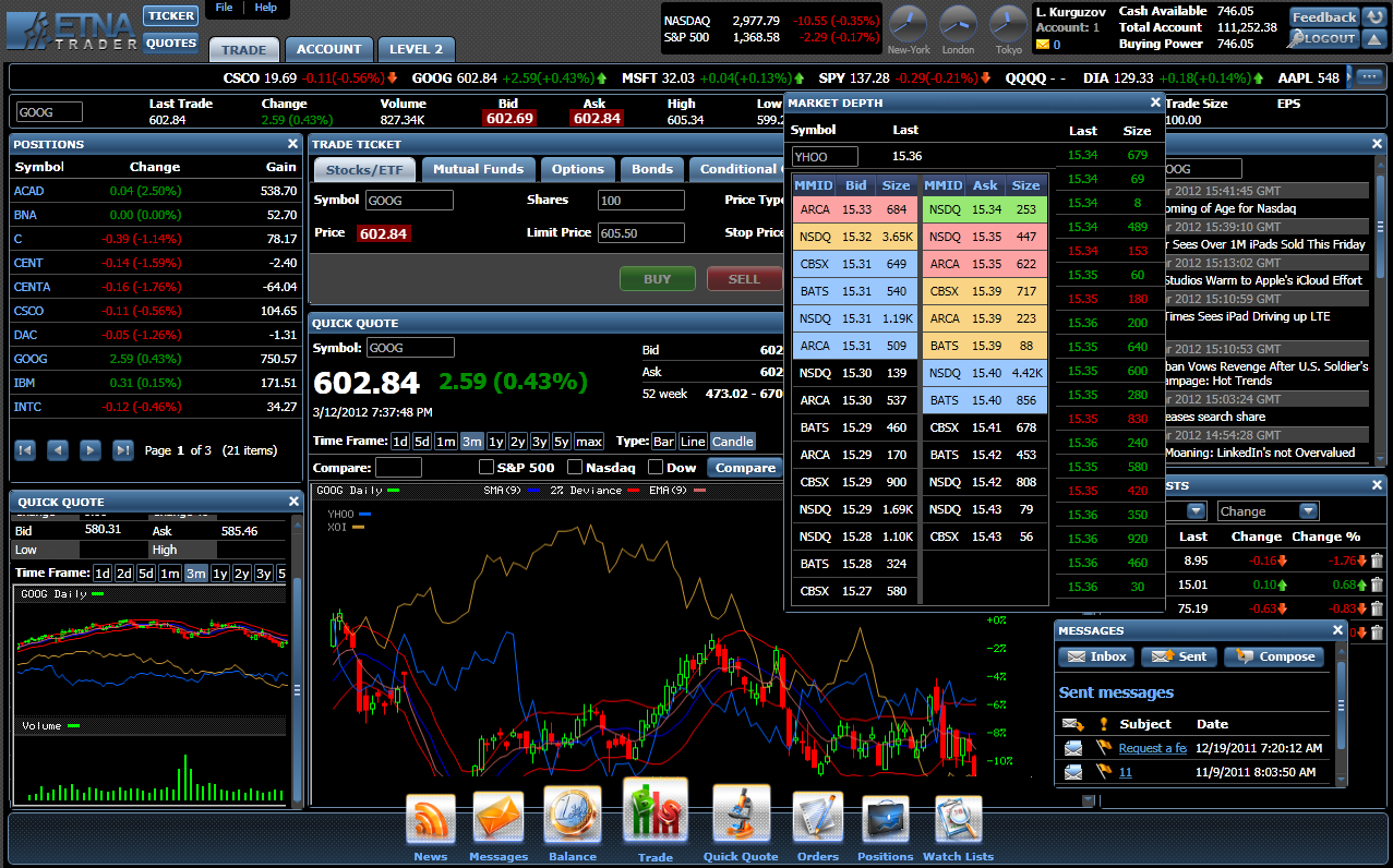
Here’s another example of great information density design; this time from the chart setup of a day trader’s trading terminal.
Now, let’s look at an average modern website.
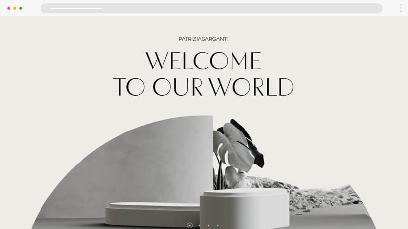
The difference is night and day. Although some people would fight tooth and nail that the modern, minimalistic designs are better, I would argue that the information-rich interfaces of the past are just as effective; in fact, they are many times more effective and even more beautiful than the current state of the web.
The Beauty of “Organized Chaos”
The early web wasn’t just cluttered—it was a masterclass in organized chaos. Every single element had a precise place and purpose; every font and image and hyperlink and button and color and layout was painstakingly coded with care and intent by the early pioneers of web development. What this essentially created was an intricate and beautiful collage of information that rewarded intentionality and exploration as a core part of the user experience. Although modern eyes might see these designs as overwhelming, they offered something extraordinarily valuable: immediate and responsive access to vast amounts of information without the need for endless navigation and clicking.
A metaphor: imagine a well-organized workshop. Every tool hangs within arm’s reach, but every surface is covered with these tools. Yes, the walls and tables are covered, but for someone who knows what they’re looking for, this density is a feature, not a bug. The old web understood this principle intimately. Sites were designed almost like digital bazaars; they were bustling with information and possibilities; every link and every element contributed to a rich, explorable environment.
This density creates an experience that feels almost more like discovery rather than consumption. Users weren’t just passive observers being fed carefully curated content; they were active participants in an information treasure hunt; every scroll; every click; every scan could reveal something unexpected and valuable.
Why Minimalism Isn’t Always User-Friendly
Modern web design’s obsession with minimalism almost universally sacrifices functionality for aesthetics. While clean lines and abundant white space might look impressive in design portfolios and GPT wrapper Y-combinator startups, they can and typically do create friction in real-world use. How many times have you found yourself clicking through multiple menus just to find a simple piece of information that could have been displayed directly on the homepage?
The problem goes deeper than mere inconvenience. Today’s minimalist interfaces often hide crucial information behind labyrinthine redirects, hamburger menus and nested dropdowns, force users through multiple page loads to access basic features, require unnecessary cognitive effort to remember where things are hidden, and, worst of all, impose a one-size-fits-all solution on user needs that are unique.
This approach assumes that less is always more, but for many users, especially power users, less is just… less.
Information Density as a Tool for Power Users
Consider the interfaces used by professionals in high-stakes environments: trading terminals, video editing software, aircraft cockpits. These interfaces embrace density because it serves a crucial purpose: rapid decision-making and efficient workflow management.
Professional 3D modeling and animation software like Maya or Houdini serves as a perfect example. Their incredibly dense interfaces pack multiple viewports, node graphs, animation timelines, attribute editors, outliner panels, and countless specialized toolbars into a single screen. What might appear as an impenetrable wall of controls to newcomers is precisely what makes these tools indispensable to professionals. Every parameter, modifier, and tool must be instantly accessible because time is critical in production pipelines. With viewport previews, procedural node networks, particle simulations, rigging controls, and rendering settings all visible and modifiable simultaneously, artists can craft complex scenes and animations while maintaining full control over every minute detail. The density enables rapid iteration and fine-tuning of thousands of parameters that influence the final output.
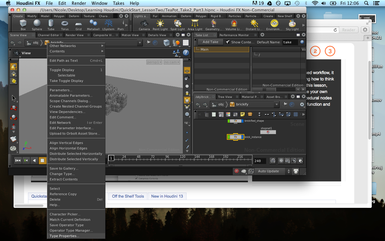
The same principle applies to other professional tools like IDEs for developers, DAWs for musicians, and financial analysis platforms for traders.
These interfaces prove that density, when thoughtfully implemented, is not just acceptable, it’s optimal.
Visual Interest and Interaction
The early web had personality. From animated GIFs to custom cursors, websites weren’t just information repositories, they were digital spaces with character and charm. This visual richness created an emotional connection that many modern websites, with their identical templates and minimal designs, fail to achieve.
Some of my favorite examples:
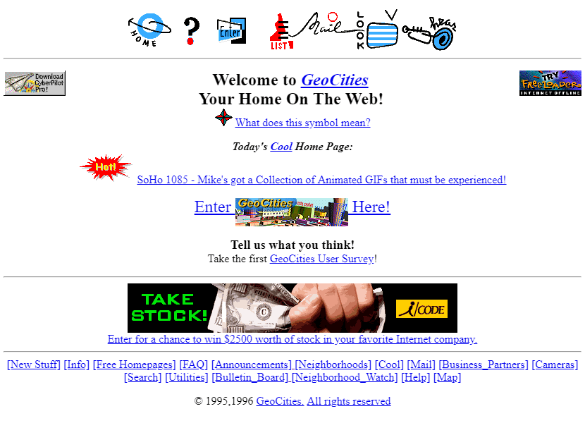
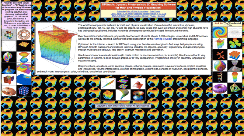
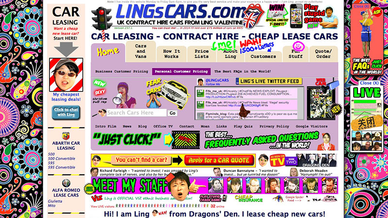
These sites remind us of a time when websites had unique layouts that reflected their purpose and personality and visual elements served both functional and decorative purposes.
This vibrancy didn’t just make the web more fun, it made it more human.
Bringing Humanity Back into Web Design
The future of web design doesn’t have to be a continuation of the sterile and minimalistic design that we have today. We can create interfaces that are both information-rich and user-friendly, that celebrate density while maintaining clarity, and that prioritize functionality without sacrificing personality.
If we reconsider how we design interfaces, we can, empower our users with immediate access to information, create more efficient and productive workflows, design beautiful yet functional interfaces that reflect the complexity and richness of human thought, and, most importantly, build digital spaces that feel alive and engaging, not sterile and dull.
The web doesn’t need to be a series of identical, minimal templates. It can be a vibrant, efficient, and deeply human space. The web can be beautiful again, and all it will take is for us to stop designing for the lowest common denominator. We need to embrace power users, challenge our audiences, and build interfaces that respect their intelligence and reward their expertise. The future of the web belongs to those who dare to demand more, from our tools, from our interfaces, and from ourselves.